Check Out the Video Below
And then we also offer in our top package as well as a la carte, a 10 by 10 engagement album. That’s their lay flat design, and that comes with 20 pages, and we typically lay out about 25 pictures on the inside. So let me give you a few tips and tricks before we get started. These are some pro tips over the years, what I’ve learned.
Keep It Classy
The biggest thing, which I feel is pretty simple, but a lot of people I think want to just put in all their work into one album. You want to keep it simple and classy, so don’t crowd your pages with too many images. Our rule of thumb internally has always been one and a half to two images per page. So a page is a single side of a spread, so that will equal about three to four images per spread. Another rule we follow internally is to not mix color and black-and-white images on a single spread. We find that that tends to be pretty distracting for the viewer.
Don't Mix
Let’s say you had a spread of three colored images and then a single black-and-white. It just visually does not make sense. So internally we have a rule where we just stick to all color-corrected images, all black-and-white images, or if you even have special toned images, make sure they’re all toned the exact same way so that it’s consistent and the spread makes sense. You also want to make sure that you’re laying out the day as it unfolds. Typically, with our clients, we have one, two, sometimes three full outfits from their engagement session. What I don’t want you to do is start mixing outfits in a single spread. It will not make sense to the viewer. It’s just disconnected. It doesn’t tell a story, it’s just putting pictures on a page.
Timeline
I always like to lay out my albums in a way that the day unfolded. So if we started here and we ended here, I like to show that progression so that when they look back on their books, they can relive that day with us.
This is also why I have our clients save their wow outfit for the very end because that impact image, we’re usually building up to that, so they have the most confidence by this point. And we are getting an incredible impact shot, their wow image from their engagement session. And that’s how we close out the book.
Variety in Focal Length
Don’t forget, while you’re shooting, think tight, middle, wide. This is not just for variety for your client’s images. This is so you can sell an album because if you don’t have this amount of variety in poses, in focal lengths, in expressions, you’re never going to be able to fill an album properly.
If you’ve got everything at one focal length, it’s just going to feel claustrophobic.
Give Solo Time to Each Person
Make sure you give solo time to both parties. This could be your bride and groom, your groom and groom, your bride and bride, whatever it is. Make sure each individual person is getting some airtime on their own spread throughout the album.
Cinematic Style
Most movies open up to establishing shots, so this is your chance to be like, “Hey, this is our couple, this is us.” So we start with that establishing shot, and then we start to introduce the characters and we let the story unfold and we end closing out the book with another shot of the two of them, usually another impact image.

Building the Album
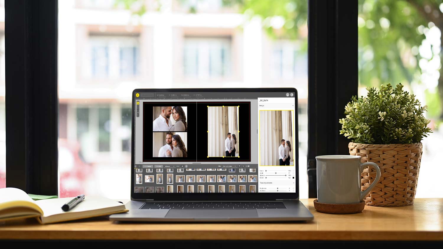
So without further ado, let’s get to building an album. So we were in Nashville a few months ago and we photographed Corinne and Josh and I thought the image just turned out perfectly. We’ve got a nice variety. This is a very standard engagement session. I’ve got 200 images to choose from. We’ve got tight, middle, wide, two outfits. We’ve got some special edits. We didn’t do any black and whites on these, but we did do some retouching of the images, not all of them. So as we’re looking through this, the majority of them are just color-corrected. And I’m going to use just the basic color-corrected ones for this album with the exception of a few spreads you’ll see what I’m talking about in a minute. So knowing that press-printed books open up to a single right-handed page, I know that I need something that’s going to fit in a square. So what I want to do here is find a scene that isn’t too off-centered.
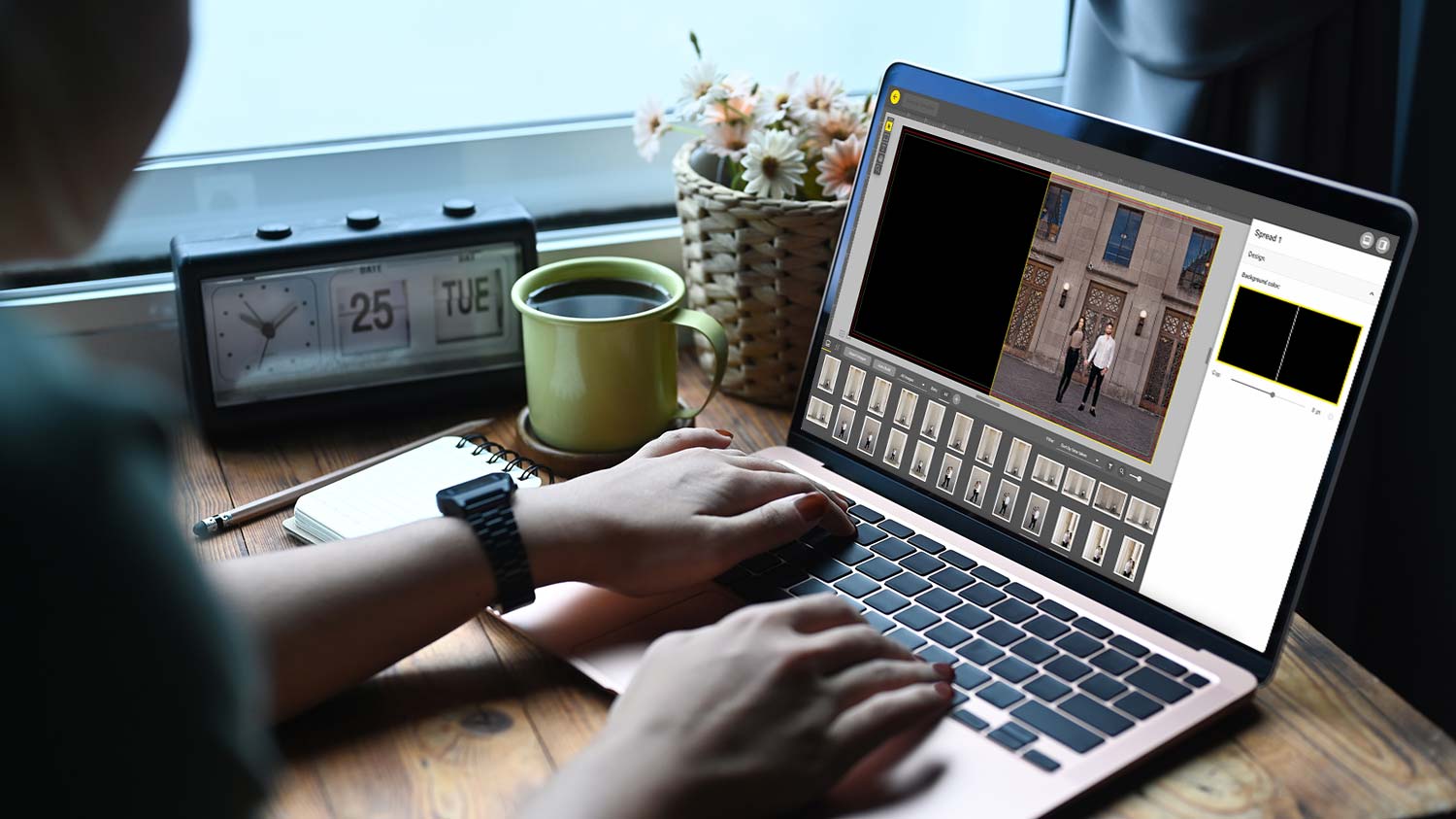
And I like to keep everything grouped by the same scene. It doesn’t necessarily have to be the same pose, but keeping them in the same scene lends to that consistency that we’re looking for while telling the story of their day. Now something that I like to do is show a progression. So these are all basically the same shot. You’ve got three verticals in a row leading into a kiss, and I like to showcase three verticals in a row, showing the progression of expressions, emotion. Here it’s them looking way, looking at each other and then leading into a kiss. So this spread is going to have a wide shot, a mid, and then a kind of tighter. I might zoom in on one of them to make it feel a little bit tighter. And as you can see, I’m really sticking to that three images per spread.

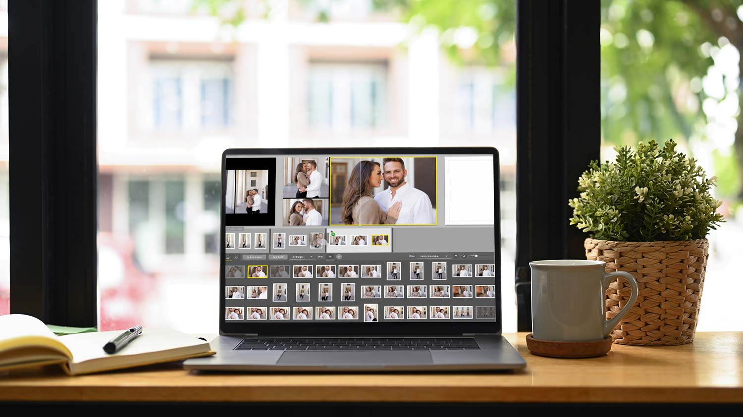
Feature the Couple
Next, I want to feature the two of them. I love his smile. Let’s put his smile in there. And then for this one, we can do this one serious, just to give it some contrast. Now, let’s showcase her, again smiling here, sassy here. So it’s kind of opposite for the two of them. And now this one, I’ve got this really nice signature edit shot. Going full bleed on an 8 by 8 or a 10 by 10, a square aspect ratio for an album gets kind of tricky because if you position them too close to the camera, you’re going to end up getting it too tight on top and bottom. Let me show you what I’m talking about. So here if I go full bleed with it, this one actually plays, I think it’s a little condensed.
I typically like a little bit more headroom, but what you can do if you’re ever in a situation like that, just come in here and add bars on the side and that brings everything in. I am okay with it going full bleed on this one. I think it fits and I think it really adds to the drama of the picture. So I’m going to keep it like that. And I love using signature edits to take up two full pages in a book. It’s nice because they’re not always going to be able to print these images big in their home. So it’s nice to have a 10 by 10. So that would be a 10 by 20 print. You could leave it out on your coffee table, however, you want to display it. It’s a nice way to showcase your image larger instead of something this big.

Showcasing Your Photography
So now we’re onto the next outfit. And what I want to do here, I want to kind of showcase some tighter pictures of each of them. So nice detail shot. Maybe we can pull off this one of the two of them really close. I’m thinking of a four-up square with an image on the right. So now I need to find the one for the right side of the frame. This is my normal process. What I’m doing right here, I’m just filling all the spreads with the images that I want together. And then I’ll go back and design because I don’t know if I’m going to mix and match stuff yet. I don’t want to waste time designing the layout of each spread until I know exactly what images I want to use.
So now that I’ve got all 11 spreads, it’s 22 pages. We started with the right single page, we’re ending with a left single page. So let’s go back to the beginning. And I actually like this layout as it chose for me. What I want to do here though is just zoom in a little bit and straighten out the bottom as best as I can. I am using a tool called SmartAlbums by Pixellu. You can use Fundy, you can use InDesign, you can use Velocity, which comes free with H&H if you are a customer ordering their albums. It’s all pretty much the same concept as far as designing albums go.
Export for Print
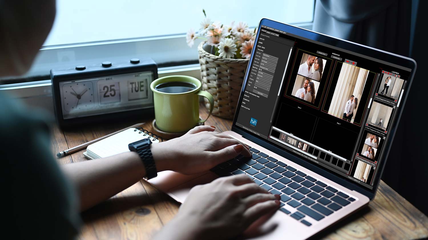
And that’s it, so let’s export for print. And while that’s exporting, I want to show you guys how we design covers. So H&H, once you’re logged into your account, you can download templates and they actually use Photoshop Actions. So you can go into Photoshop and create your own template. That is what the guides that I’ve created based on their action. Okay, so now we have our cover and all of our spreads ready to go into HH Studio. Please do not be overwhelmed by this software. They customized it to make it as easy as possible. And while it’s not your typical rose software, it is actually so much more robust. And it’s one of those things that once you start using it and getting comfortable with it, it is so much easier and efficient for your workflow as far as ordering goes.
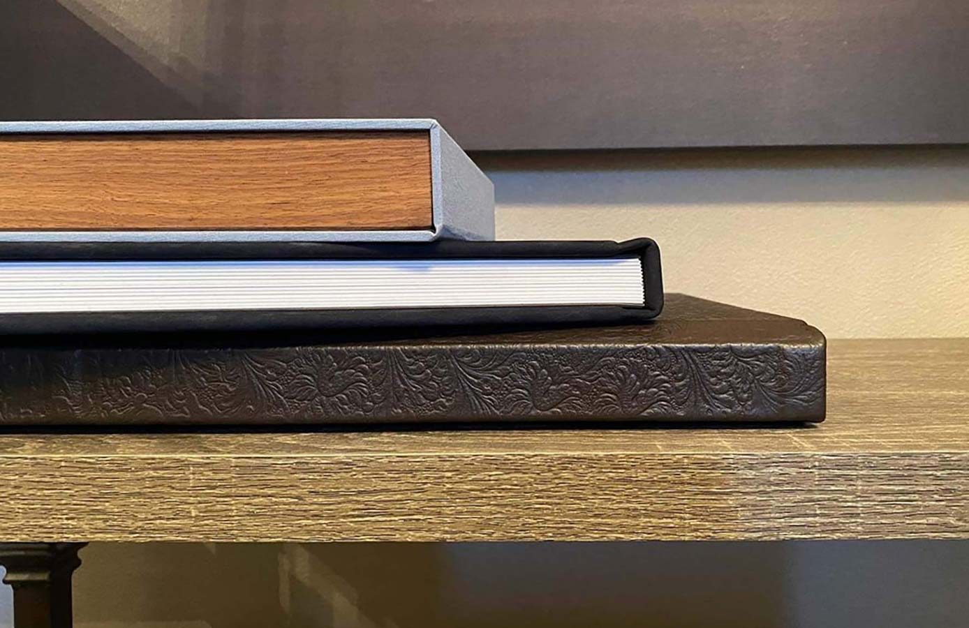
So let’s start an order. This is Hein, engagement. This is part of the wedding. And yes, I want to upload images. So let’s go to the spreads. Because I exported a single page, I don’t need to upload the black blank. Okay, so now we’re going to go into books, press printed, press books, perfect stitch, hardcover. We do a 10 by 10 square. We do the lay flat and a photographic velvet. So the lay flat, the pages are thick and it’s a lay flat gutter. And then the photographic velvet is for the cover. And that’s like a nice soft touch velvet. So price point of $82. This is a no-brainer for your packages. It allows you to price your packages in a way that you are extremely profitable while still providing a very high-quality product for your clients. So let’s just start adding the pages. This is a simple drag-and-drop.
And that my friends, is it. It’s that simple, I promise. Adding engagement albums and designing engagement albums, it’s not complicated. And H&H Color Lab has the best quality press printed books. It feels good in your hands. The photographic velvet cover is such a nice, subtle, elegant touch. So definitely check them out, hhcolorlab.com.